Using Color and Texture to Calm the Senses
- moodestoart
- Dec 25, 2025
- 3 min read

A calm room isn’t defined by one color or style. It’s defined by how much effort the eye and body have to make to exist in it. Color and texture quietly control that effort. Too much contrast creates tension. Too many textures compete. Too many colors fragment attention. Restraint allows the senses to rest.
Limit the Palette, Expand the Tone
Calming spaces often use fewer colors - but more variation within them. Warm neutrals, soft gradients, and muted hues allow light to do the work instead of contrast. This creates depth without stimulation. The goal isn’t flatness. It’s cohesion.
For instance, consider a room decorated with soft beige walls complemented by an array of creams and light taupes. This limited palette can be expanded with subtle variations. Perhaps a single piece of art features a rich, gradient blend of sandy hues, reminding one of sunlit beaches. This thoughtfully curated color selection encourages relaxation, as the eye isn't overwhelmed with competing shades.

Echo One Color — Then Stop
A simple move that works consistently is to repeat one color from the artwork somewhere else in the room. This could be a cushion, a book spine, or a ceramic object, and stop there. Such a tactic creates a quiet connection without turning the room into a theme. More repetition doesn’t strengthen the effect. It weakens it.
For example, if your room's artwork prominently features soft blue tones, try adding a single blue cushion to your seating area. This subtle repetition fosters coherence without overwhelming the senses. It emphasizes a singular focal point, allowing the viewer's attention to settle, while the presence of that color in two places helps to unify the space.

Texture Slows the Eye
Smooth surfaces reflect attention, while soft textures absorb it. Digital art with visible grain, painterly transitions, or subtle depth interacts gently with light, reducing visual noise. Texture doesn’t demand attention. It softens it.
This is also why textured art often feels calmer over time than perfectly flat imagery. The interplay between light and texture pulls the eye across it gently, creating a soothing experience rather than a jarring one. In your interiors, consider incorporating textured wall hangings or soft, tactile fabrics that draw focus without being assertive.
For instance, a canvas print featuring a textured abstract artwork can evoke feelings of peace and tranquility. In this way, texture becomes an essential part of your calming environment.

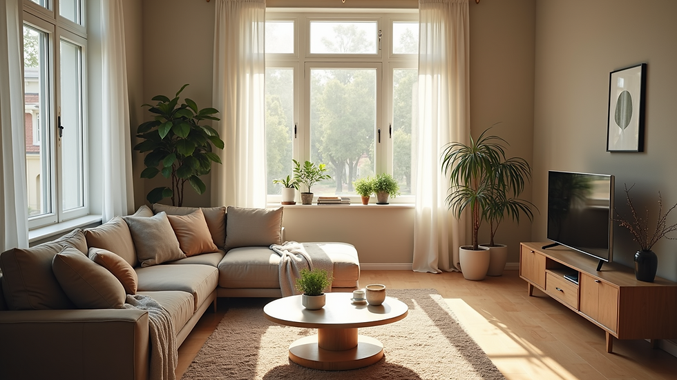
Light Completes the System
Natural light reveals texture slowly. Artificial light sharpens contrast. Where possible, let daylight interact with artwork. It changes tone throughout the day, allowing the room to feel alive without becoming busy. Calm emerges when nothing needs to compete.
Think of a room with large windows that let the sun filter through delicate sheer curtains, washing over subtly textured walls. As daylight shifts, the play of light and shadow emphasizes the textures, creating a dynamic yet calming aesthetic. If your space does not have ample natural light, consider using warm artificial lighting designed to mimic daylight, as it can soften harsh contrasts and further promote a tranquil environment.
When the Room Lets You Rest
If a space allows your attention to drift, the balance is right. Color and texture don’t decorate a room; they regulate it. And when they’re used with restraint, calm follows naturally.
Picture a room designed with intention where the muted palette results in soothing hues, and elements of texture provide depth. The interplay of soft light, gentle colors, and cozy textures culminates in an environment that invites relaxation. This deliberate curation means that when you step inside such a space, you experience an immediate sense of peace, as the room embraces you with its serenity.
In summary, using color and texture in thoughtful ways can significantly enhance your surroundings. By limiting your palette, echoing one color, embracing calming textures, and allowing light to interact gracefully, you can create a setting that nurtures calm. The art of designing these spaces lies not just in aesthetics but in the sensory responses they evoke.
By utilizing these insights, you can transform your home into a sanctuary of calm, inviting both tranquility and serenity into your daily life.


Comments